

DESIGN WORKS
MENSWEAR DESIGN
SHOWCASE
Design direction, systems thinking, and execution—expressed through real-world brand work.
// Lead Designer.
From defining brand hallmarks to guiding execution across sketch, 3D, and final product, I focus on building design frameworks that scale while maintaining clarity and character. The following case study demonstrates how my design philosophy and approach come together in practice—shaping menswear collections that are grounded, considered, and distinctly purposeful.
PROJECT CONTEXT
This project was developed within the Tommy Hilfiger menswear framework, where I served as Lead Designer for Tailored Shirts. My role focused on translating brand DNA into clear, scalable design systems—guiding color, print, fabric, and silhouette decisions across seasonal collections.
Working within an established global brand required balancing creative expression with consistency, commercial viability, and cross-functional collaboration. The design work shown here reflects how brand direction becomes tangible product—through disciplined systems, thoughtful execution, and a modern menswear point of view.
Role: Lead Designer, Tailored Shirts
Scope: Color, print, fabric, silhouette, seasonal systems
Focus: Translating brand DNA into modern menswear product
ESTABLISHING BRAND HALLMARKS
Strong menswear design is built on clear, repeatable principles. Within this brand framework, I defined and evolved a set of core hallmarks—color, print and pattern, and fabric texture—that serve as the foundation for seasonal storytelling and product development.
These elements act as both creative and practical tools, guiding decision-making across sketches, materials, and final execution while maintaining consistency, flexibility, and brand clarity.
COLOR
Color is used to reinforce brand recognition while introducing seasonal nuance—balancing iconic tones with fresh accents to keep collections relevant and expressive.


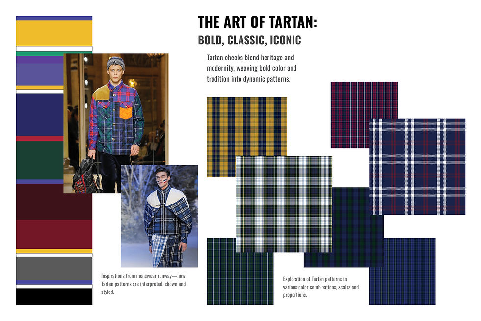
PRINT + PATTERN
Print and pattern are used to extend brand character through scale, rhythm, and contrast—balancing heritage motifs with modern interpretations to create visual interest while supporting seasonal storytelling.


FABRIC TEXTURE
Fabric texture is employed to add depth and dimension to the collection—layering familiar materials with seasonal weights and finishes to enhance versatility, tactility, and everyday wearability.
DESIGN SYSTEM IN ACTION
I design menswear by building systems that translate brand direction into repeatable, flexible outcomes. Across color, graphics, form, and product, each decision is made to ensure clarity, consistency, and creative momentum—while leaving room for evolution season after season.
COLOR + CONCEPT
Color and concept establish the emotional and strategic foundation of each season. I begin by defining a clear thematic direction—grounded in brand DNA, cultural context, and product intent—then translate that narrative into a disciplined color language and pattern approach. Concept is not decoration; it is a system that guides palette decisions, pattern scale, and visual rhythm across the line, ensuring consistency while leaving room for evolution.
Process Highlights
– Define seasonal concept—Establish narrative, mood, and cultural references aligned with brand DNA.
– Build color architecture—Create a primary palette supported by neutrals, accents, and seasonal statements.
– Translate concept into pattern—Explore scale, placement, and repetition across prints and textures.
– Test for product application—Evaluate color and pattern across silhouettes, categories, and fabrication.


SKETCH
Sketching is where concept and system converge into form. I use digital illustration as a flexible design tool—balancing expressive line work with technical clarity—to explore proportion, silhouette, and detail before committing to development. Each sketch is not an isolated idea, but part of a larger visual language that tests how color, graphics, and construction work together across the collection. The goal is to establish newness while maintaining consistency, ensuring that creativity remains intentional and product-ready.
Process Highlights
– Translate concept into form—Explore silhouette, proportion, and styling informed by seasonal direction.
– Develop design language—Establish recurring design cues, details, and visual rhythms across styles.
– Integrate color and graphics—Apply palette and pattern decisions to evaluate balance and impact.
– Prepare for execution—Refine sketches to support downstream 3D development and product realization.


3D RENDERINGS
3D renderings are used to validate design intent before physical sampling. They allow me to test proportion, construction, color placement, and material behavior in a realistic environment—ensuring ideas translate accurately from sketch to product. This step accelerates decision-making, reduces iteration cycles, and aligns design vision with technical execution.
Process Highlights
– Validate silhouette and proportion.
– Test color, graphics, and material interaction.
– Refine construction details prior to sampling.


PRODUCT
Final product represents the culmination of concept, system, and execution. Each piece reflects disciplined design thinking—where color, pattern, texture, and form work cohesively across the line. The result is menswear that feels intentional, wearable, and brand-true, while delivering seasonal relevance and commercial clarity.
Process Highlights
– Ensure consistency across categories.
– Balance design integrity with wearability.
– Deliver cohesive, market-ready collections.
DESIGN IMPACT + LEADERSHIP
Beyond execution, my role as Lead Designer was to shape clarity within complexity—aligning creative vision with brand DNA, market realities, and cross-functional collaboration. From early concept to final product, I led design decisions that balanced innovation with consistency, ensuring every outcome felt intentional, elevated, and commercially relevant.
Creative Direction
I set and guided the seasonal creative vision, translating brand DNA into clear, focused design intent with room for evolution.
System Consistency
I built disciplined design systems that ensured cohesion across categories while allowing flexibility and creative variation.
Cross-Functional Leadership
I partnered closely with cross-functional teams to align creative ambition with execution, driving clarity and momentum throughout development.
Market Execution
I balanced innovation with commercial awareness, delivering products that felt relevant, intentional, and market-ready.
DESIGN POINT OF VIEW
This work reflects my belief that strong menswear design lives at the intersection of clarity, system, and expression. Whether shaping color direction, building repeatable frameworks, or guiding execution across teams, my focus remains consistent—to design with intention, elevate brand voice, and create work that feels both relevant and enduring. These principles continue to guide how I approach every project, regardless of scale or category.
– Design direction grounded in system thinking.
– Execution informed by craft and collaboration.
– Creativity aligned with real-world outcomes.